Flow: Profiles
Promoting collaboration in Flow
As the sole product designer on Flow, it was my responsibility to carve out the look and feel for these pages, as well as solve the UX problems they presented.
Collaboration & Networking
How do we create a space for Organization members to collaborate and find each other? How do we encourage users to spend more time on Flow?
Profile Pages System
I created a set of profile pages that displayed member lists for organizations, encouraged customization, and promotes more time spent in Flow by allowing networking to happen in-app.
Project Objectives
- Encourage collaboration in Flow
- Encourage users to spend more time in Flow
- Enable in-app networking and communication
Early Development
This set of pages would create a lot of changes for the existing app, so refinement in early & low fidelity stages was crucial for its success. While crude, a look at my early sketches provides valuable insight into the structure I wanted to create for the pages at early stages. Frequent communication and feedback made this stage the best it could be.
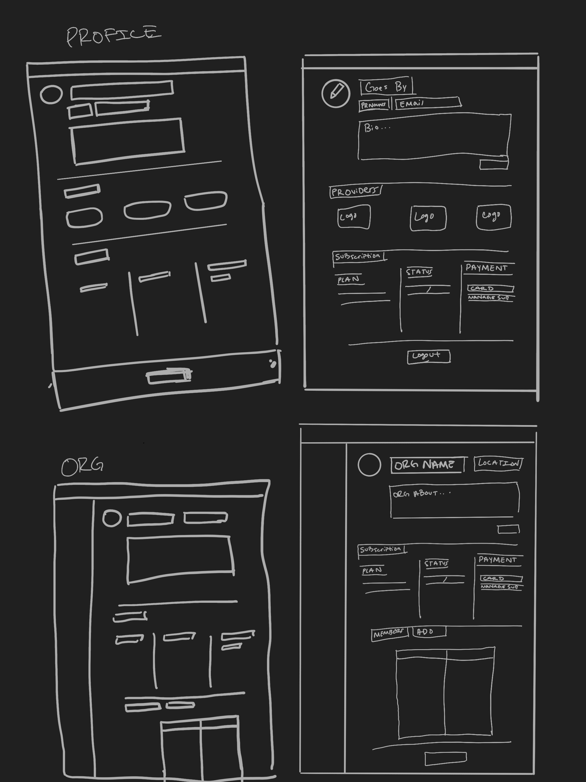
Early sketches and wireframes showing initial page structure concepts
Page Overview
The profile pages for organizations and individuals pictured in the carousel below were the central solution for the problems presented to me. For these pages, I lifted the existing members module on the right side of the page, to give it more real estate and make it more robust in terms of information. I also created timeline pages specifically for these pages with more personalized events, as well as a new way of displaying products in the second rightmost column.
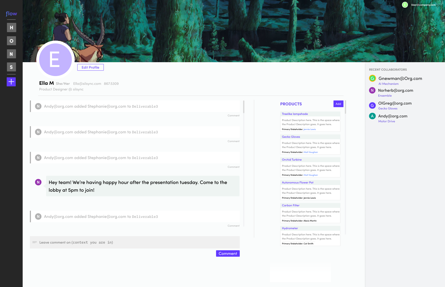
Individual profile page layout
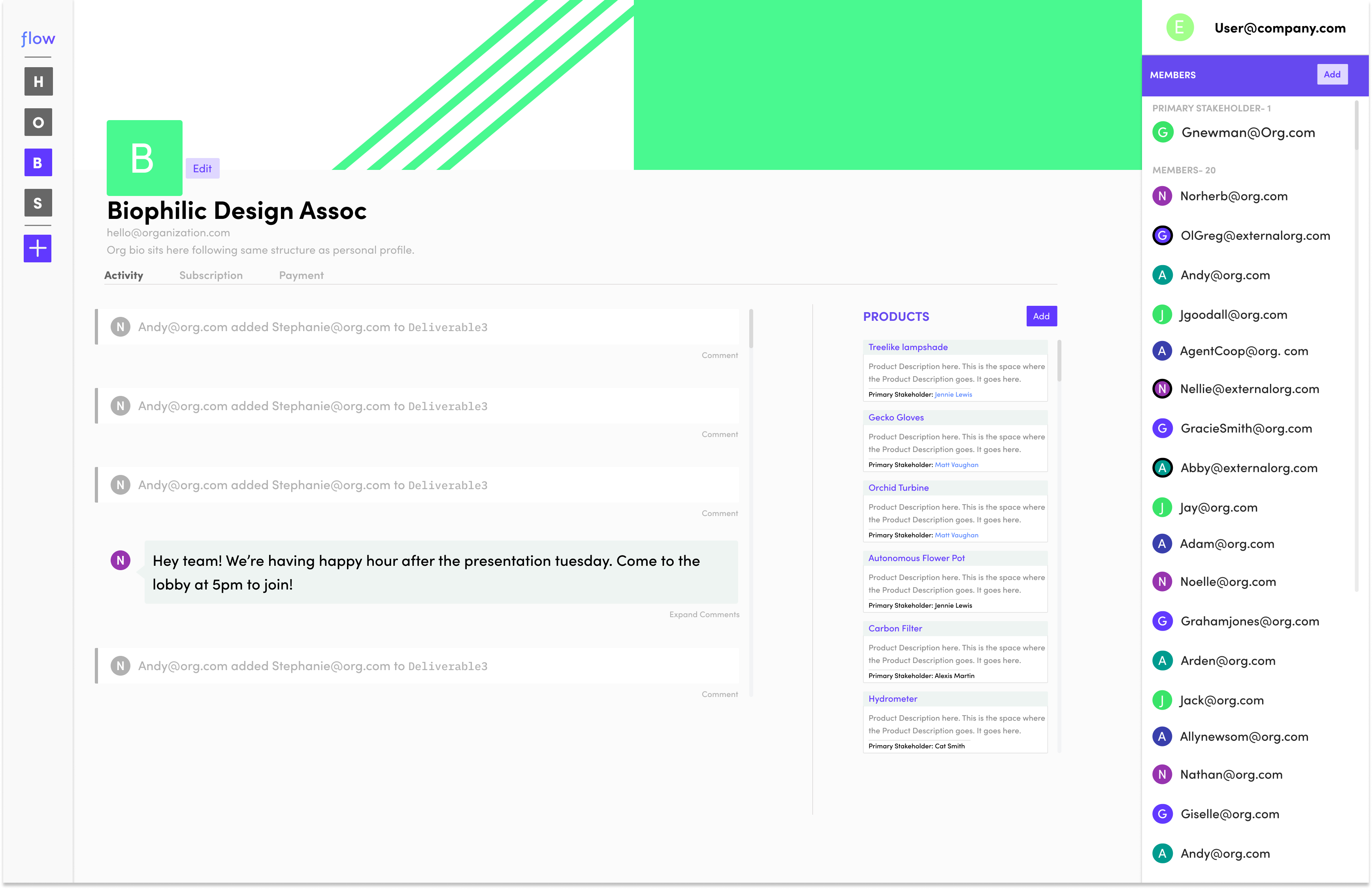
Organization profile page design
Profile Settings
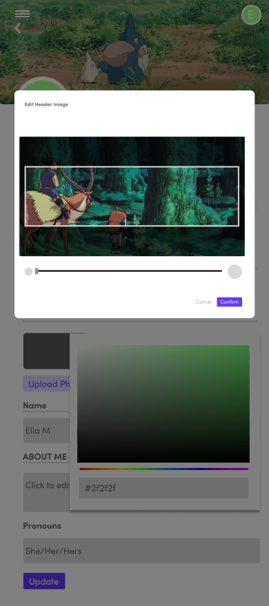
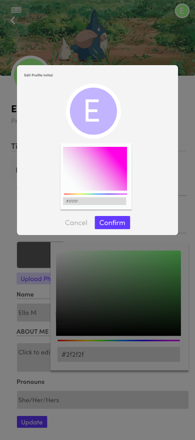
The customization of the profile page aimed to be a huge factor in keeping customers engaged with the app. Here are the high fidelity layouts for the profile settings and customization features.
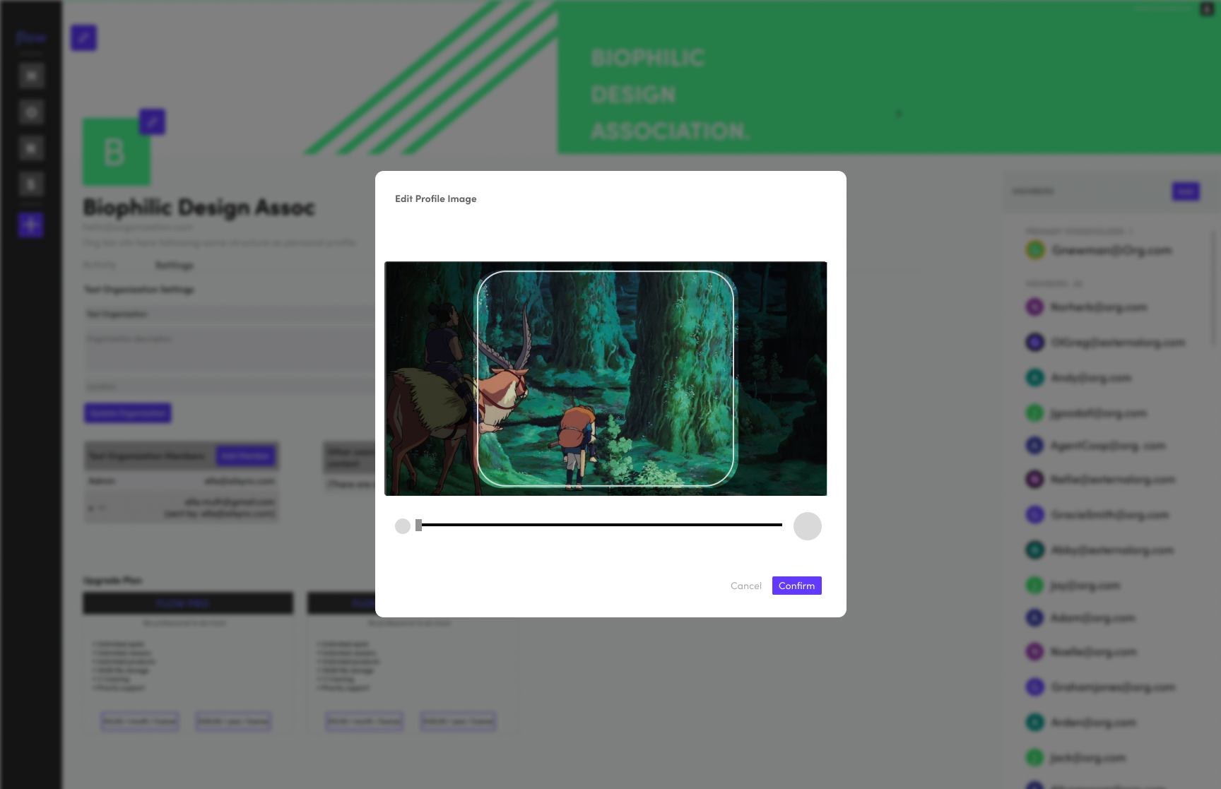
Organization profile editing

Organization profile display

Personal profile customization

Personal profile display
Members Lists
Depending on the context in which you are viewing them, Members lists provide a grounding place to view how someone can access a product, and their role on said product. In the case of a members list on an organization profile, the list shows the primary stakeholder, or 'owner' of the organization while also showing each member.
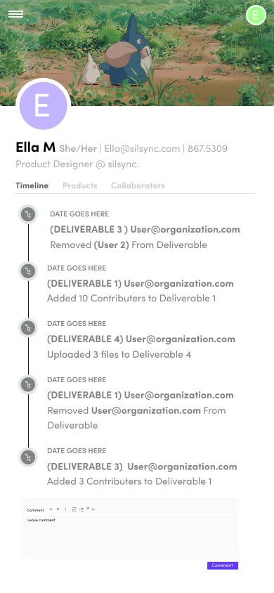
Mobile Layouts
The Profile pages felt especially critical to get right on mobile, here are a few examples of how the pages look on smaller screens, from core experiences to editing pages.
