SILSYNC Flow
Software for Hardware
As the Product Designer for Flow, I was responsible for the software’s design system and user experience. I also handled all the front-end development for Flow during my first eight months in the role.
Complex Engineering Workflows
Key information is often missed or hard to locate due to the complexity of projects and the number of digital surfaces they span. We set out to consolidate digital collaboration into a single source of info for everyone involved, Flow.
Flow (What is it?)
A PLM software for engineers, members of their team, and contractors to stay on the same page. Flow moves a project through its lifecycle via intuitive Product Breakdown Structure visualization, file storage, and collaboration within project timelines.
Project Objectives
- Consolidate workflow dispersion into a single app, create a “single source of truth” for engineers to reference their projects.
- Create value for everyone involved in the hardware pipeline, focusing on engineers, PMs, and contractors/vendors.
Core Functionality
At its most fundamental, Flow is a way to help people involved in the Electrical and Mechanical engineering workflow stay synchronized and aligned by building out a PLM software around Product Breakdown Structures, a hierarchical chart comprised of the individual components that make up an engineering project. To add value to users, we needed to take the large amounts of information associated with full product breakdown structures and translate it into an incremental, easily navigable format that encouraged communication and collaboration, all in one place.
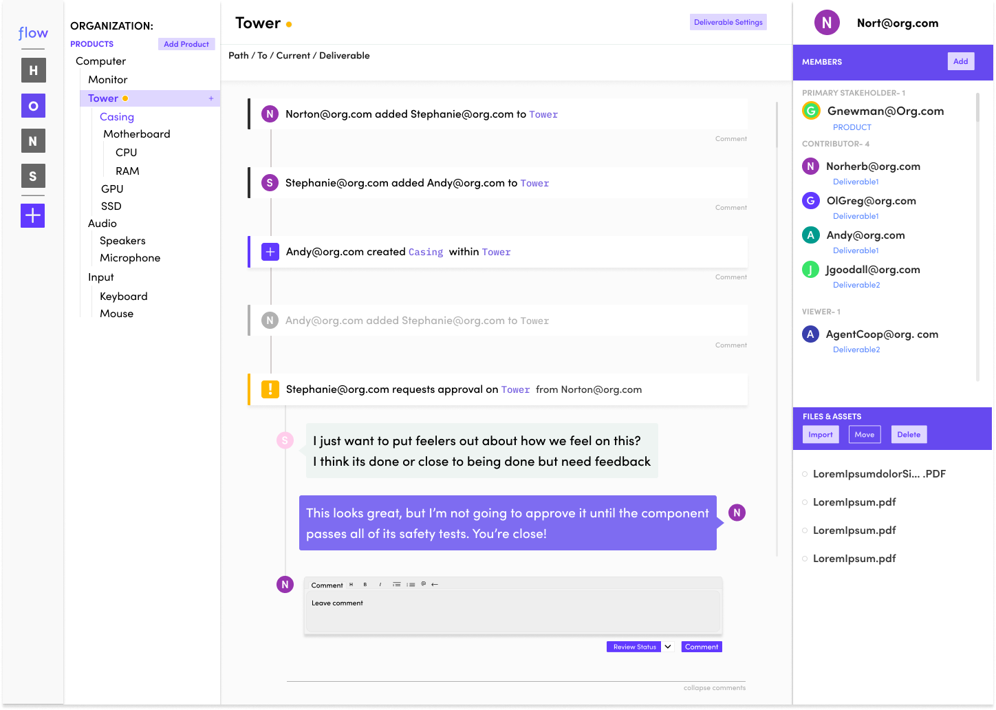
In the example screen below, we are looking at “Tower”, a sub-component for the Product “Computer”.Each sub-component for a product has a unique timeline view with information keyed to the component being viewed and its children. This way, users can quickly find information and updates regarding the parts of a project they are specifically tied to, without being bogged down with information that doesn’t directly impact their scope of work.

A Product's hub page - where you can sort through product information as a whole or increasingly granular contexts.
Compatibility & Accessibility
All of Flow was designed to allow navigation between light and dark modes based on system settings. I did not want to implement this feature at launch, as our resources and time were spread quite thin. However, key internal stakeholders felt it was pressing to have a dark mode-compatible product for our beta launch. My school of thought here is that certain purely visual elements, such as dark mode, are a luxury, especially in small, agile startup environments. I believe that in the early days of a product’s lifecycle, especially in remote, startup environments, Designers need to emphasize usability, responsivity, and accessibility before jumping into more “flashy” features, considering that flashy features can create a lot of meta work for devs.
I was very fortunate to have a great working relationship with our back-end developer, who felt similarly about early prioritization, and we were able to ensure usability and compliance needs were being met while leveraging stakeholder wishes for the app’s trajectory. I say this constantly, but a close, open line of communication between design and dev teams is essential to a product’s success. Using the dark mode example, if we hadn’t had such a proactive team dynamic, both parties would have likely drowned in bug fixes and user feedback for the features implementation. Instead, we delegated with intention, helped each other when necessary, and shared skills and knowledge to ensure our sprints stayed on track and met stakeholder and user needs.

Hub screen showcasing Flows dark mode interface.
Iterations
Always be iterating! Flow went through so many versions before we landed on one we loved as a team. While the core UX of the product remained mostly the same, some very key navigational features didn’t come into play until later in the product’s life. Most unique to earlier builds was context and content filtering through hashtags as a primary navigation method. Experientially, I wasn’t thrilled with exploring the app this way because of how many nested child components there can be in product development. If you were to take an iPhone, for example, thinking of the phone itself as the parent product, there would easily be a hundred-plus nested components within it. Even projects from users working on microchips routinely had 20+ nested components.
1:1 Chat Module
Direct messaging functionality for team communication. This was scrapped with the intention of being added in later sprints
Context Tag Filtering
system for structure and navigation. Scrapped due to being less intuitive than a visualized PBS.
Sidebar Redesign
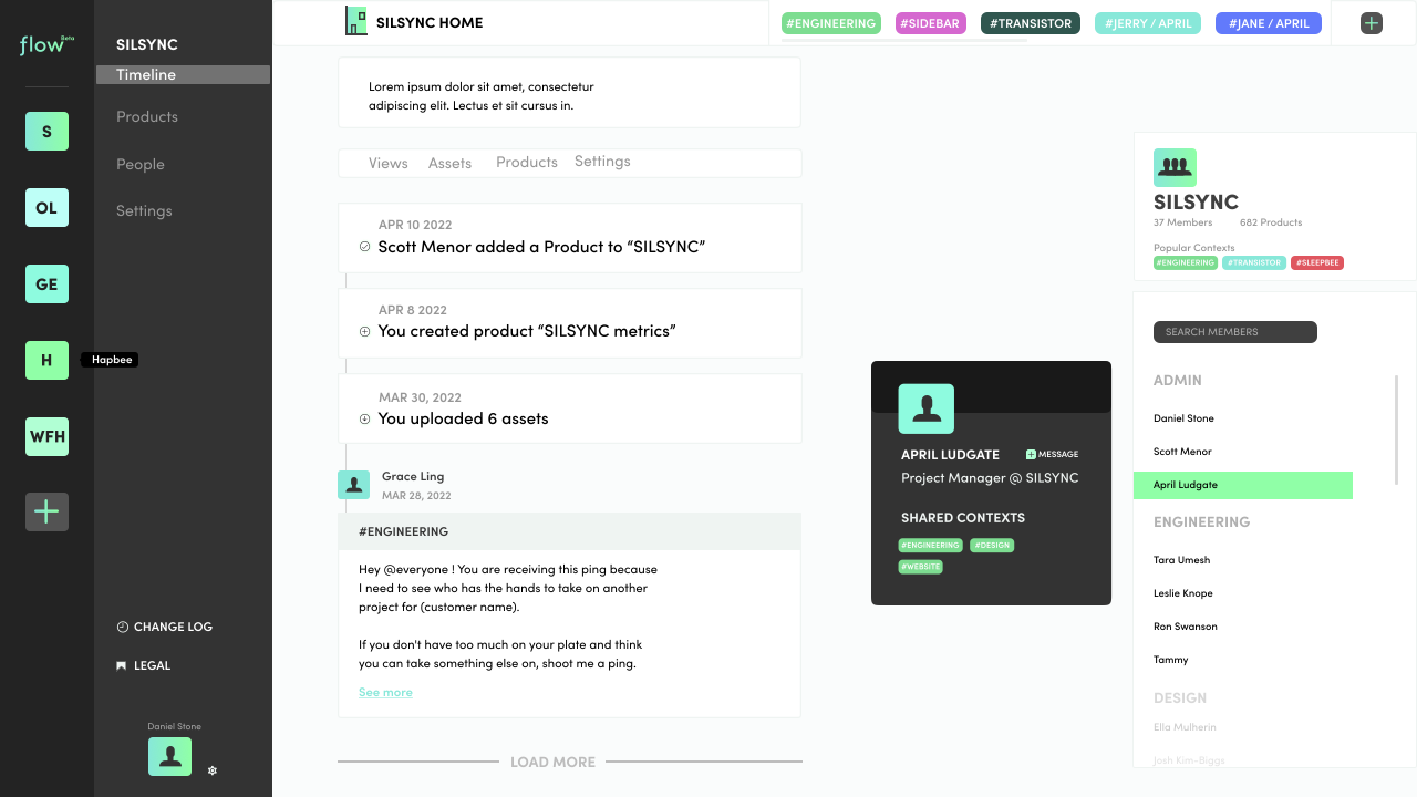
Initial sidebars as well as timelines were completely zoomed out on a full organization as opposed to projects, and were more focused on direct messaging than PBS.

Previous iteration showing earlier design approach
User Interviews
Throughout the design and development process, I conducted user interviews to determine exactly what Flow needed to be.
At the earliest stage of development, I spoke primarily with business partners and investors to gain a deeper understanding of the niches within their industry and who fit where. I identified three main user groups: Electrical/Mechanical Engineers, Product Managers, and Suppliers. Once we entered beta in early 2022, I began testing features targeted to the 3 main groups, interviewing them routinely (we’re talking multiple times a week in earlier sprints). We were fortunate that our CTO and co-founder had a background in engineering, which resulted in a large network of beta testers close to the startup’s management team who were quite open with us about product trajectory and satisfaction.
A pitfall of having a number of our beta testers close to key players was bias. It was not uncommon for beta testers in that category to pitch ideas directly to higher-ups. While many of the ideas were big, exciting, and frankly good, most would have changed the trajectory of Flow entirely. It was my job, leading design, to moderate the feedback and gently nudge decision makers in the right direction. The design and dev team became pros at defending UX decisions by keeping our pitches succinct and impact-focused, through data visualization and atomic/hierarchical design principles, to make our findings easy for stakeholders to digest.
Tree View
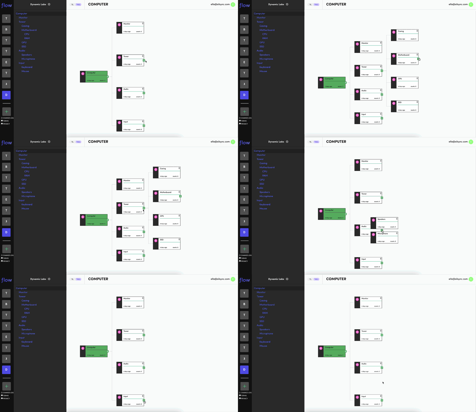
A currently scrapped idea from me and our Web Developer is the product tree. The tree is an interactive visualization of your Product Breakdown structure. While beta users found this method of viewing their projects useful, it was not feasible for us to implement it in any of our sprints due to time and prioritization constraints.

Interactive PBS tree view showing hierarchical project structure